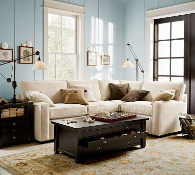
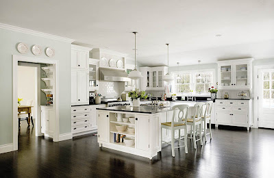
I think this shade of blue is the cat’s meow. But I am somewhat intimidated to try to recreate this color in my own home.
You see, for me, blue is a hard paint color to choose-it always looks many shades darker on the wall than on the paint chip. When choosing the blue for our kitchen, I test drove many, many paint chips. We lived in a rental while the house was being built, and Mr. Marvelous was a good sport in letting me scotch tape paint chips in giant groups all over the walls.
This picture (below) was my inspiration kitchen, I printed this picture out as large as I could and held it up to those paint chips, over and over, in different lights, trying to find the right shade. It was an impossible task. And the color-match process at Lowes was not helpful.
I eventually gave up and went with my instincts: River Rapids by Ralph Lauren.
I was very nervous about this paint color because it was the first paint color I chose for the new house and the last thing I wanted to do was mess the place up before we even moved in to it! I even hired a pro to do the paint job-something I’d never done before. I’ll never forget sitting at my desk at work when the painter called at the end of the day to let me know they had finished the job. I asked him how it looked and he responded “well, when we first opened the cans we thought ‘yuck’, but it ended up okay.”
Well, I don’t know what his kitchen looks like, but I think it is more than okay.
And it coordinates with my china.
We are happy here. Especially Fred Thomas.
But I am still hesitant to revisit the blue chips in the paint isle. I wonder how green is to work with . . .
Thoughts?


I think you did a fabulous job. It is a worry with the blue paint. You know when everybody was doing Red walls and there was the “good” red and the “bad” red? Well, this is very good blue! Actually, perfect blue!
I think it looks really great! It was hard to see how blue it is in that picture (it looked so light, could kind of see it on the right hand side of that far window.) Fred Thomas seems pretty happy, hee! 😉
Hi Erin,
Picking paint colors is ABSOLUTELY THE HARDEST PART of building a house. My dear hubby and father had just finished painting my family room with its 10 foot ceilings when I returned from a workshop, took one look, and announced, “Oh, this color will never do!” They just about went into caveman mode and drug me off by my hair….. The room did get repainted in a much more pleasing color after they had several days to calm down. Your kitchen is gorgeous. I love the clean crisp look of your subtle paint color.
Very well done.
Oh Terri! What a story!! What was the color? You are cracking me up! 🙂
Sweet Caroline, you are so sweet. Ahh, “a very good blue,” I like the sound of that.
I love your house and have loved the picture of that kitchen also. The house that that kitchen belongs to was just featured in Better Homes and Gardens’ Feb. issue. They list the kitchen paint color as Palladian Blue #HC-144 from Benjamin Moore & Co. I, too, was looking for that color blue and used Restoration Hardware’s “Silver Sage” & Sherwin Williams’ “Contended” and “Comfort Grey” in my own house. I love how peaceful it makes my house feel.
-Noelle
Oh I just love it! You know me– Blue is my favorite– I just picked out two RL paint colors for our new place: Blue Mesa for most of the downstairs, and then Club Navy for the Dining room. I’ll share pics when its all done (probably 2 months).
P.S. — I did end up selling my brown sofas and will be purchasing white for a more airy effect 🙂
Your blue is perfect… gorgeous! Blue is so much better than green! HA. My kitchen was green before the current soft blue and my bedroom is green and going sand next week! And did I mention I love my blue dinning room with my black Pottery Barn table and chairs?
Be bold… find courage… if you haven’t noticed today… you are talented! You could make a pink kitchen rock! :0)
Blue & green are my two fave colors. This is a great blue! I just painted one wall in my bedroom a really fun green and I love it. I wish I had another space to put it bit I just don’t. It’s a good pop of color but may be too overwhelming in a large space. I did a sneak peak of it on my blog a few weeks ago if you want to check it out. It is called Guacamole and its really fun! I’m sure you’ll make a great choice. Your kitchen is gorgeous!
Green can be tough too. I tried quite a few greens before settling on Favorite tan from Sherwin Williams. It is a great color and looks different in each room. I wanting a clean fresh color to travel throughout our first floor. We have an open floor plan so all the rooms tend flow together. It was hard to find a good starting a stopping point so I found just the right color and painted all the walls. Happy painting:)
Melissa
We LOVE your new kitchen…blues are way hard to pick! kari just picked out “Rain” by Sherwin Williams for her dining room…but it was a journey..LOL!
Have a blessed and wonderful day!
smiles, kari & kijsa
I have been trying to convince my husband for 3 months now that subway tile is not something to be afraid of. Your kitchen made him a convert! 🙂
LOL @ at the cat! 🙂